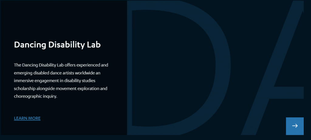
What does it mean to be accessible? UCLA’s Disability Studies Inclusion Labs are places where students, faculty, and community members can explore and practice access and inclusion in transformative ways. For example, the Autism Media Lab brought together teams of students and autistic self-advocates to develop short documentaries on barriers to inclusion for persons with autism. The Lab resulted in several documentaries, one of which, Inside the Frame, highlights the ways students and self-advocates addressed barriers to communication and collaboration within their teams, practicing access while creating stories about inclusion. As another example, the Dancing Disability Lab has brought together disabled artists from around the world to challenge ableist norms within dance, pushing back on dominant cultures and aesthetics within visual performance. This immersive program demonstrates how expanding access ignites creativity, as artist participant Suzanne Cowen reflected, “There’s such an opportunity there to clatter around on stage and be, you know, as disruptive and chaotic as you want to … where people can really explore what a disability aesthetic is” (2019 Dancing Disability).
I joined the Disability Studies Implementation Team in Summer 2020 to help with creating content for the redesigned Inclusion Labs website. In many ways, the process of redesigning the website grew into its own sort of lab: it was a dynamic and collaborative learning experience where we wrestled with critical questions around disability representation and accessible design in digital space. Although the website launched in March 2021, the Implementation Team continues to iterate and improve on our approaches to accessible design on the site as new questions and needs arise. Ongoing discussions have included meaningful hyperlink text and creating web content in plain language.
I invite you to explore some of the ways we built the Inclusion Labs website with access in mind, while also creating opportunities for visitors to learn about accessible design.
Creating meaningful access to visual information
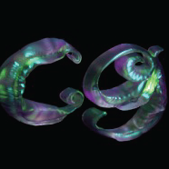
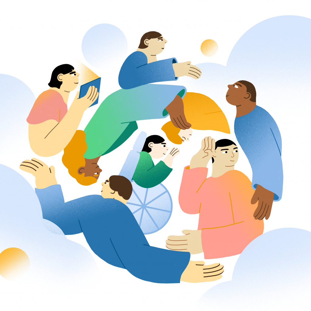
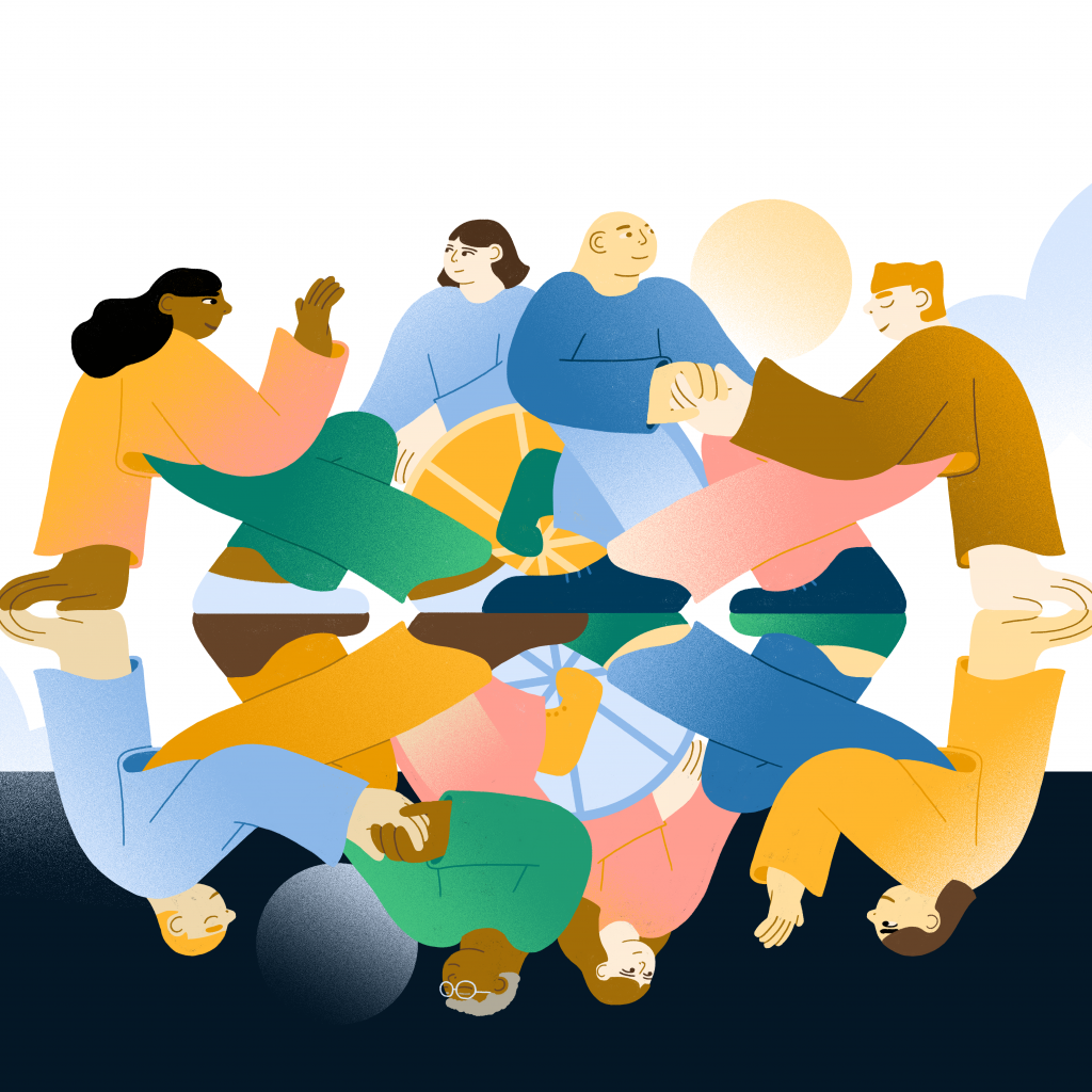
As part of the design process, our web development team, Kley, connected us with artist Janice Chang who worked on a series of illustrations for the new website. An early conversation between our teams was how to represent a range of disability types and assistive technologies, a process we describe more fully as part of our visual descriptions of the illustrations. The site’s illustrations represent what Léonie Watson describes as emotion rich images, “images that provide a website with a sense of atmosphere.” As such, we developed alternate text that was not just descriptive (e.g., “image of three people on campus”) but actually emotion rich, designed to evoke the feeling of the illustration. This process pushed our team to articulate why these images felt so visually compelling.
But writing the alternate text was only part of the process. An initial iteration of the website had marked these illustrations as decorative, which means screen reader technology would skip over it. This was an issue with the website’s code, so we worked with Kley to ensure the banner images on each page were formatted to include alternate text. A final step in this process was working with our Community Consultants and UCLA’s Disabilities and Computing Program to review and test the site, which identified issues with how the alternate text was loading that we sent back to our web development team to fix.
Exploring multiple meanings of design
When Kley first presented the large, scrolling text on the Labs landing page, we met to talk about whether the aesthetic fit in with the rest of the site. When I saw the scrolling visuals for the first time, it immediately reminded me of a book talk I had recently attended by Sara Hendren on What a Body Can Do?. Sara spoke about the oversized text on the book’s cover, which spilled onto the spin and into the interior jacket, and how this picked up on the book’s themes around places of misfit between bodies and the built environment. Although this was not the impetus behind Kley’s original design, it was exciting to explore other meanings and interpretations that aligned with disability studies scholarship. Our team worked with Kley to refine the design, slowing down the scroll, reducing the length of the text to make it easier to read, and ensuring there was an accessible, accompanying title and description of each lab.
Developing resources on writing an image description
Part of populating and maintaining the new website involved writing alternate text for all of the headshots of people involved in the Inclusion Labs (e.g., the matrix of UCLA Disability Studies faculty). We included a request for visual descriptions whenever we ask for individuals’ biographies and headshots for the website, this reflects best practice in asking people to describe themselves rather than having a third party describe them. We support this request by providing a resource on writing visual descriptions, which considers length, level of detail, and the importance of including relevant social identity markers. As Deafblind lawyer and disability rights advocate, Haben Girma describes, representation matters and incorporating markers of social identity provide “blind individuals access to visual descriptions that are readily available to sighted individuals,” which can help prevent harmful assumptions.
Creating an inclusive welcome
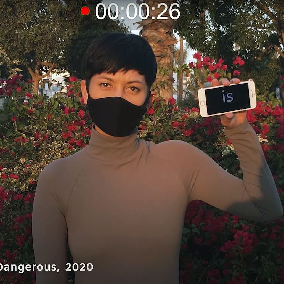
During our community review of the website, we got feedback that a welcome video in American Sign Language (ASL) describing the purpose of the website would create a more accessible homepage for Deaf community members. We loved this idea and worked with UCLA Lecturer Benjamin Lewis to create a welcome video for the homepage. Taking a universal design approach, we incorporated audio description of the video, which is narrated by Community Consultant, Beth Ribet. As audio description is less commonly featured in online videos, we provide a brief description of the purposes of audio description at the beginning of the welcome.
Using our newsletter to share accessible practices
We have dedicated a section of our quarterly newsletter to content about accessible practices, from alternate text to captions in Zoom meetings. The Creating Access section provides ongoing opportunities for the Inclusion Labs Network to learn about the ‘why’ and ‘how’ of accessible design.
We invite you to continue engaging with the Inclusion Labs website as it develops and to join the Network to learn more about how to fold access into your day-to-day practice!